Fontsmith launch new digital typeface too flexible to name: FS Untitled
Boutique type foundry, Fontsmith, today announce a new addition to their library of typefaces called FS Untitled. The latest addition from the Clerkenwell-based foundry, developed with screens firmly in mind, makes possible the kind of very fine adjustments to weight that can be crucial in keeping characters sharp on-screen, and reduce the reliance on font hinting. It also makes possible a whole lot of fun, in a ‘digital playground’ that lets the typeface’s many variants off the leash.
FS Untitled’s roots lie in Fontsmith’s creation of the iconic typeface for Channel 4’s rebrand in 2005: the classic, quirky, edgy C4 headline font, with its rounded square shapes and blocky baseline serifs, and a toned-down version for use in text, captions and content graphics. Eleven years on, the text font is still going strong in C4’s online presence, but the broadcaster’s ten-year exclusivity license on the font has passed, leaving Fontsmith free to develop it for a much wider audience.
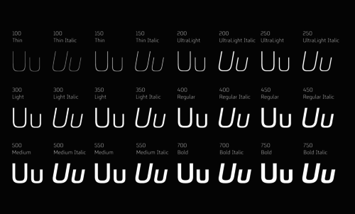
The studio has built on the characteristics that made the original face so pixel-friendly: its blend of almost-flat horizontals and verticals with just enough openness and curve at the corners to keep the font looking friendly (inspired by the classic cartoon TV shape of a squidgy rectangle). The studio has developed a wide array of weights – 12 in all – with the intention of meeting every on-screen need, from a thin weight to a bold.
The studio went a stage further. Fontsmith founder, Jason Smith, who oversaw the development of the new face, wanted to offer designers and web developers much greater flexibility in the display of text, and lessen the dependency on font hinting, which corrects the ‘jumping’ of pixels in text characters. Hinting is a valuable tool, particularly on low-resolution displays, for producing clear, legible text. But it can’t do the whole job all the time. ‘However valid hinting is,’ says Jason, ‘it’s irrelevant if the design isn’t fit for purpose or the weights aren’t effective on certain background colours or images, or at certain sizes.’
The studio has created two versions of each weight to allow designers and developers to go up or down a touch in font weight if text isn’t rendering well on a certain colour. Two weights for each weight, in other words, which makes for incredible flexibility and versatility, and preserves the integrity of the original design. ‘It’s a digital-first world,’ says Jason. ‘And I wanted to make something that was really functional for brands. I also wanted to create something that stylistically was open to its use. So a thin weight, large, gives a very different feel to the text font in body copy.’
To bring the new typeface even further into the digital world, the 12 weight pairs have each been designated with a number from 100 (Thin) to 750 (Bold). It’s a system that echoes the one used by Adrian Frutiger to identify his Univers font family, but which Fontsmith intend to reflect the numbering that web developers use to refer to font weights in CSS code.
Go to the ingeniously distracting playground built to launch the typeface, though, and each weight is given four different activity zones and an interactive specimen sheet in what its designers, The Space Between, call a ‘digital playground’. In each zone the word Untitled is replaced with a description of the scene like ‘FS Zombie’, ‘FS Alchemist’ etc. ‘We needed to show the timeless beauty and endless flexibility of the typeface,’ says Matt Rudd of The Space Between, ‘With such a range of weights, personalities and possible applications, from apps to websites to digital billboards, the family was never going to sit comfortably under a single specific name. ‘FS Untitled’ was the only solution. This fits perfectly with Fontsmith’s Brandfont® concept, which allows companies to customise and rename fonts under a corporate license.
‘We worked hard to create many different kinds of typographic execution. All scenes are interactive - for example, FS Zombie is a fully-functioning arcade game and FS Alchemist takes the user from LEAD to GOLD via every letter in the alphabet.’
Co-founder Steve Jones adds, ‘The idea of designing and building 48 unique interactive scenes seemed like sheer madness. But it has been a really exciting project and we think all the hard work has paid off.’
Visitors can interact with the site, create their own graphic moods, get inspired and inspire others by sharing their favourite parts. Fonts have never been this much fun…
Have a play: http://www.fontsmith.com/fs-untitled
ENDS
About Fontsmith
Fontsmith is a leading and established boutique type foundry known for creating fonts that are distinctively human and full of character. Founded in 1997 by Jason Smith, Fontsmith today represents a truly international team of designers working from a London studio.
The Fontsmith library includes an extensive collection of typefaces – elegant and traditional, contemporary and quirky – suitable for a range of applications. In addition the team design and create bespoke typefaces for global brands, as well as design and advertising agencies. For more information visit www.fontsmith.com.
About The Space Between
The Space Between is a creative collaboration between Matt Rudd (Rudd Studio) and Steve Jones (digital creative and musician). It was born out of a recognition of shared values and principles in our different creative pursuits. We take on projects which draw on our blend of experiences and strengths in design, branding, digital, art and music. Amongst many others, we’ve worked with Channel 4, ITV, Brian Eno, Framestore, AIR and Florence + The Machine.
Contact:
Tamasin Handley
tam@fontsmith.com
0207 490 9380
07825 040 842
26-27 Great Sutton Street
London
EC1V 0DS
